


01
Start with severity.
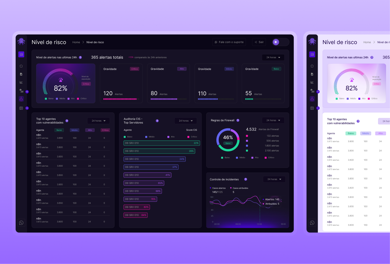
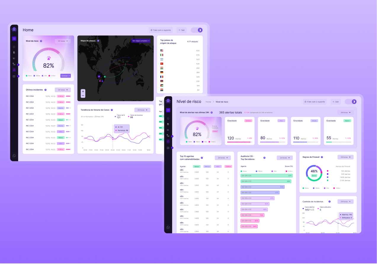
Risk level and alerts appear first to guide where analysis should begin.
NG-SOC platform
Operational clarity without losing technical depth.
The challenge
Organize information from disconnected tools for analysts and leadership. With the product already defined, I focused on research, information hierarchy and interface design.
01 / The problem
Before
The analyst switches between tools to understand the alert, gather evidence and decide how to respond.












In practice
Alerts and evidence were on different screens. Gathering context required manual work.
Analysts needed shared access to evidence, tasks and next steps.
Leadership needed clear dashboards to follow risks and priorities.
After / With SecurityOne
Signals, evidence and actions connected in one shared experience to investigate, respond and monitor.
SIEMSOARDFIR / ITSM SecurityOne
 Investigate
 Respond
 Monitor
02 / My contribution
I researched security product references to guide information organization and screen design.
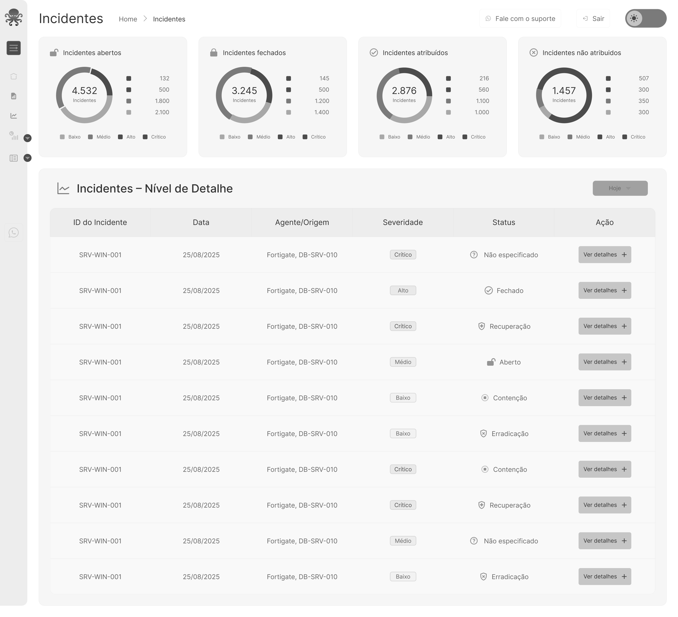
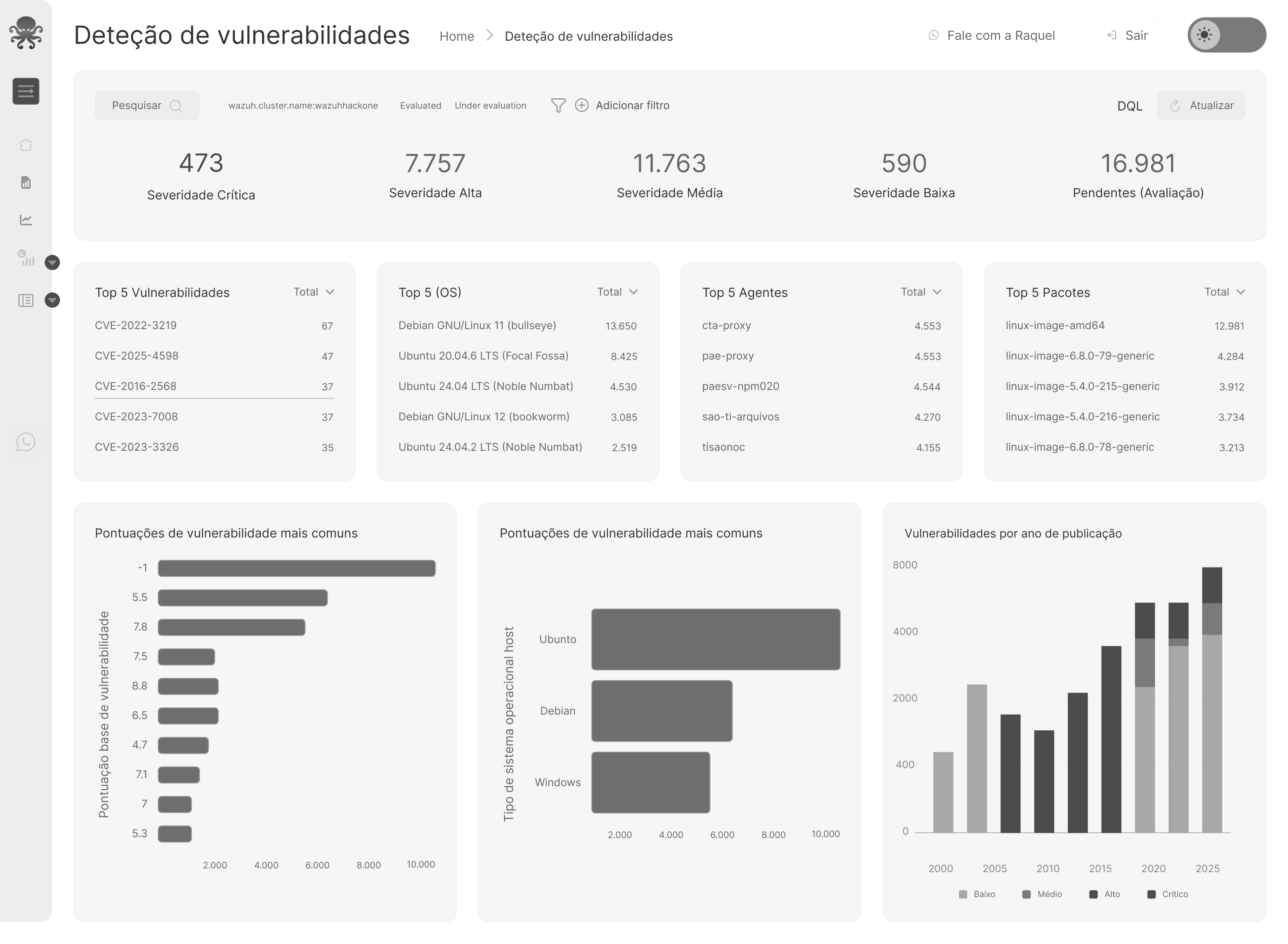
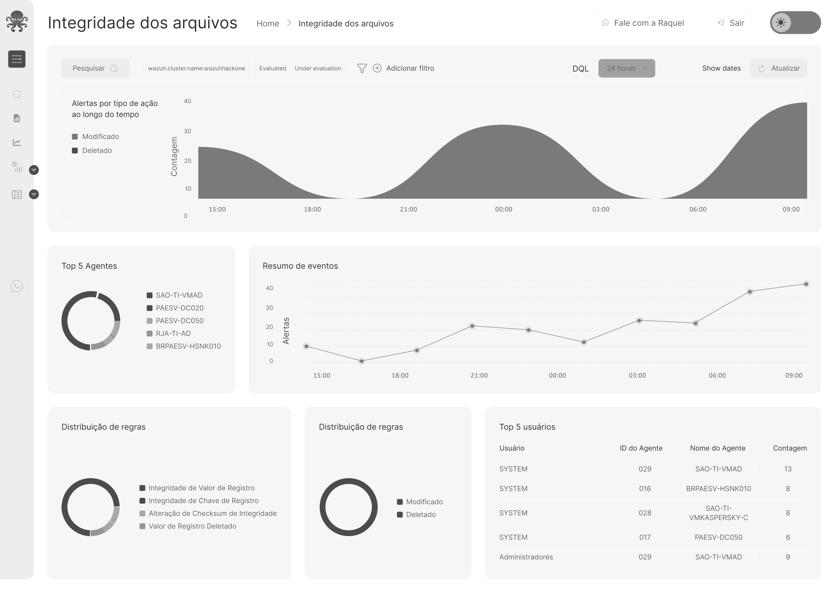
I organized indicators, filters and tables by task: monitor risk, investigate and inspect details.
I designed a shared experience for different tools while preserving technical detail.
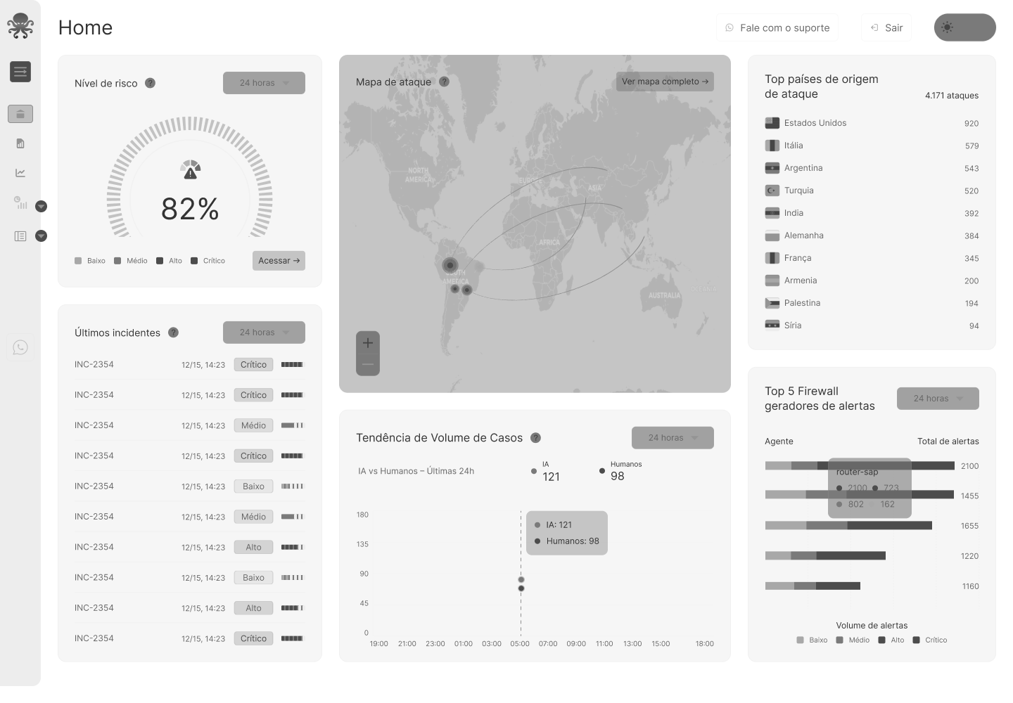
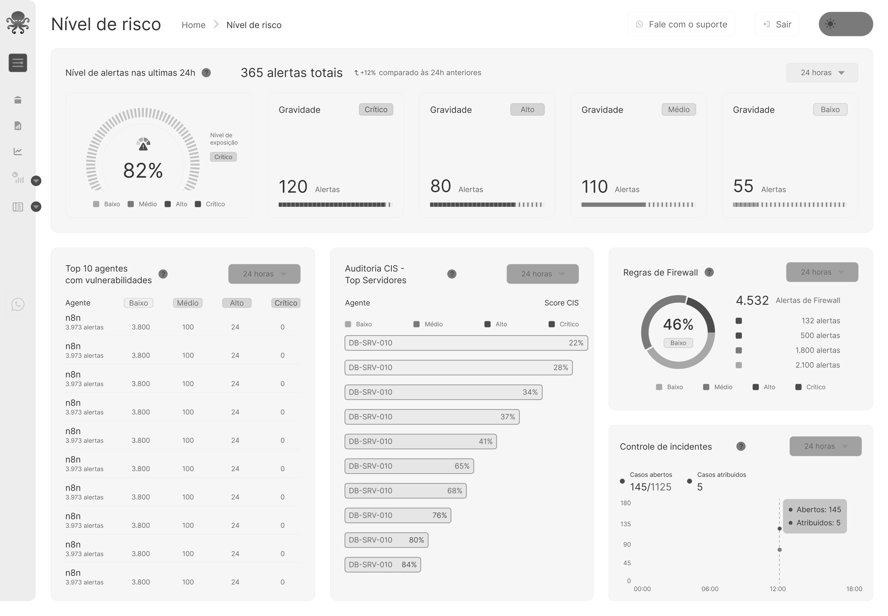
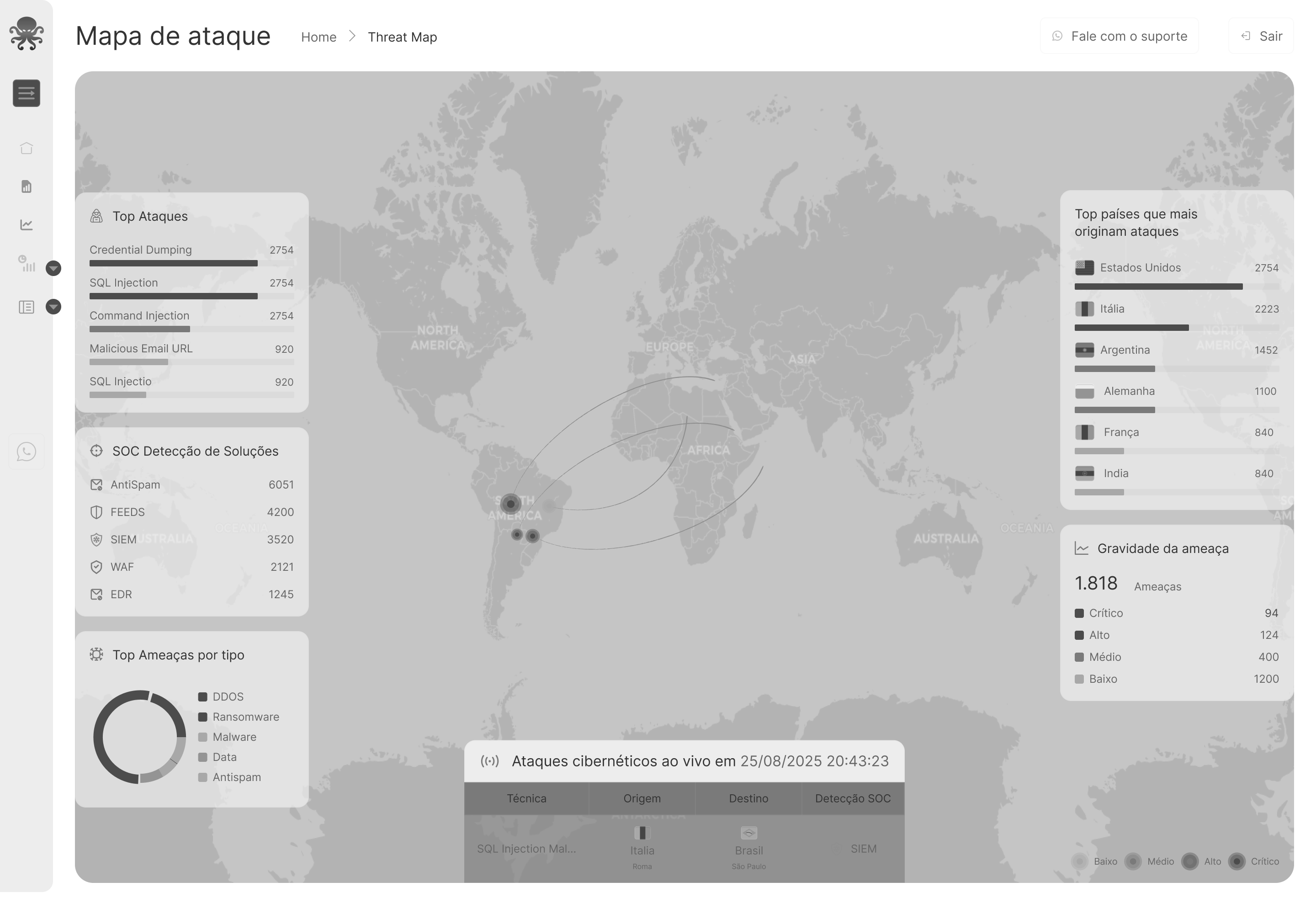
Wireframes
03 / Interface decisions
Risk level and alerts appear first to guide where analysis should begin.
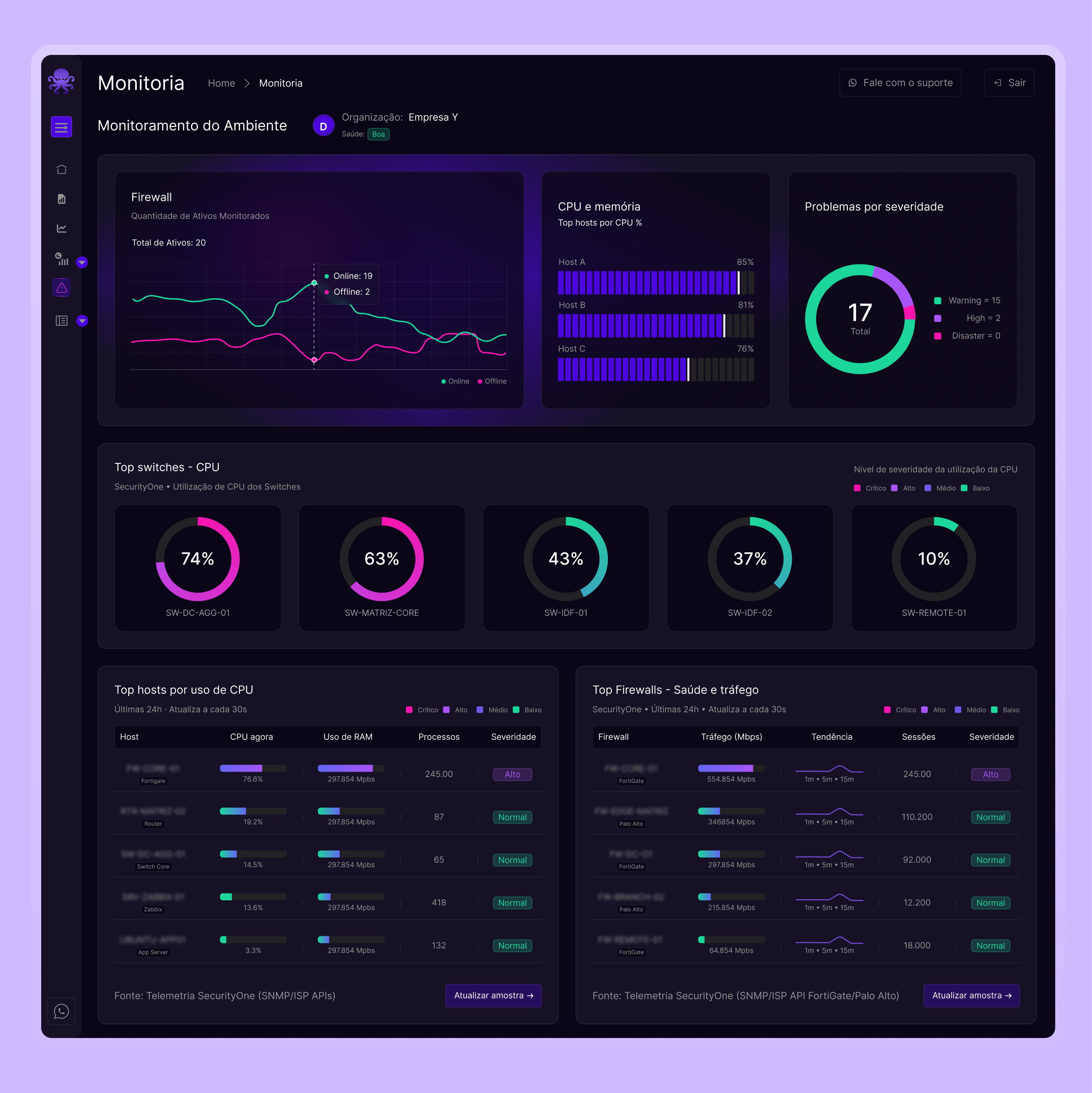
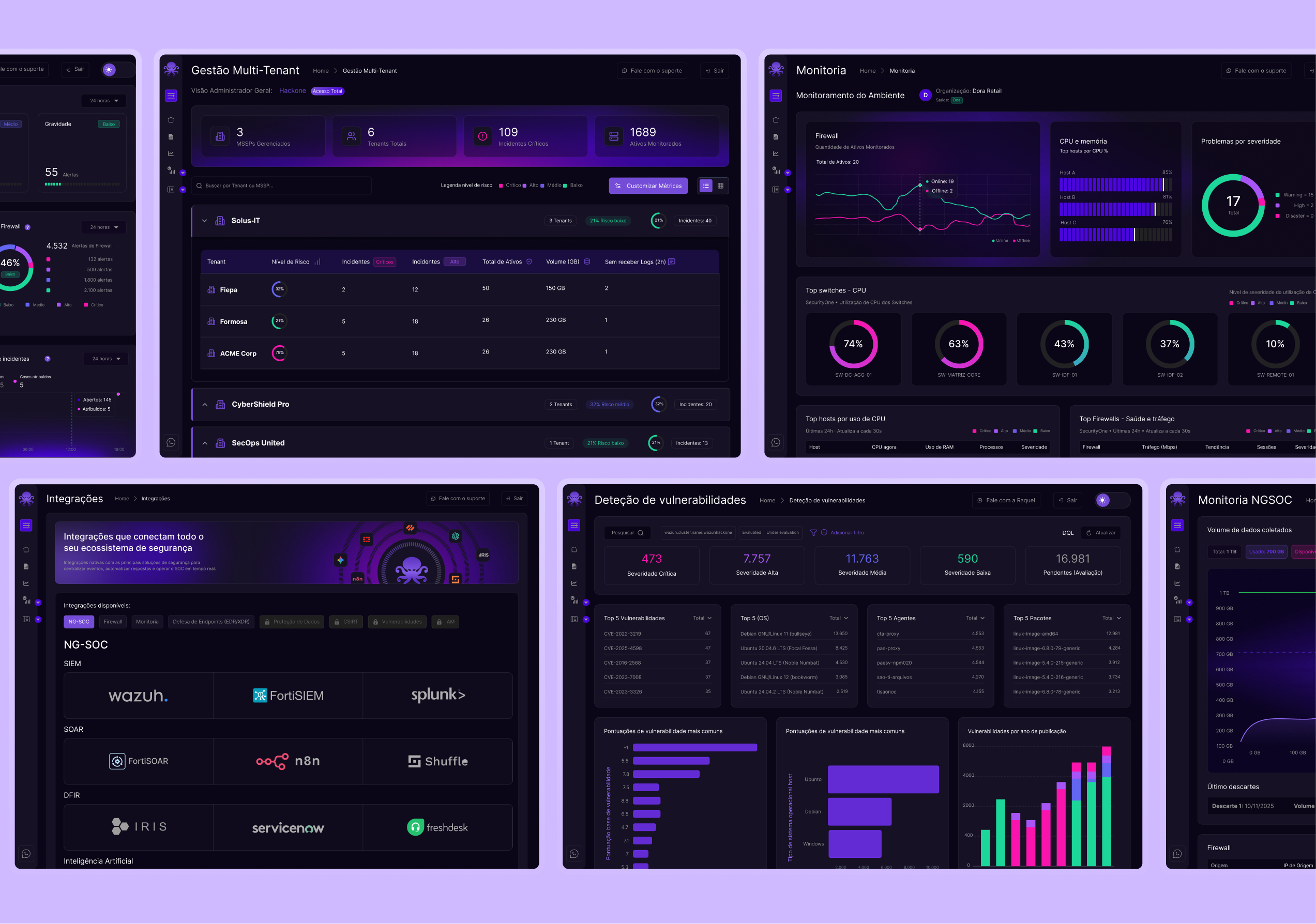
Monitoring, integrations and vulnerabilities have dedicated views within the same navigation.
Filters, severity and states follow shared patterns to support orientation across screens.
04 / Identity and system
The symbol, risk indicators and components connect the visual identity to the platform experience.

05 / Operational views
Management, monitoring and vulnerability views make it possible to inspect details while keeping the big picture.
06 / The product logic
The product connects detection, response and incident management. Evidence and tasks support operations; dashboards provide visibility for leadership.
Modules, dashboards and initial playbooks support operations.
Integrations, filters and playbooks adapt to each client, supported by setup and training.
07 / What the design delivers
Dashboards and investigation screens bring together risk, incidents and vulnerabilities.
Severity, volume and status in focus to support triage.
Consistent components and states across modules and light and dark themes.
08 / Conclusion
I turned a defined product model into interfaces for analysts and leadership. The next evaluation step would be testing real tasks and measuring triage and shift continuity.