

All work

Private aviation / Concept

AERA

Brand identity and digital experience, at the traveler’s pace.

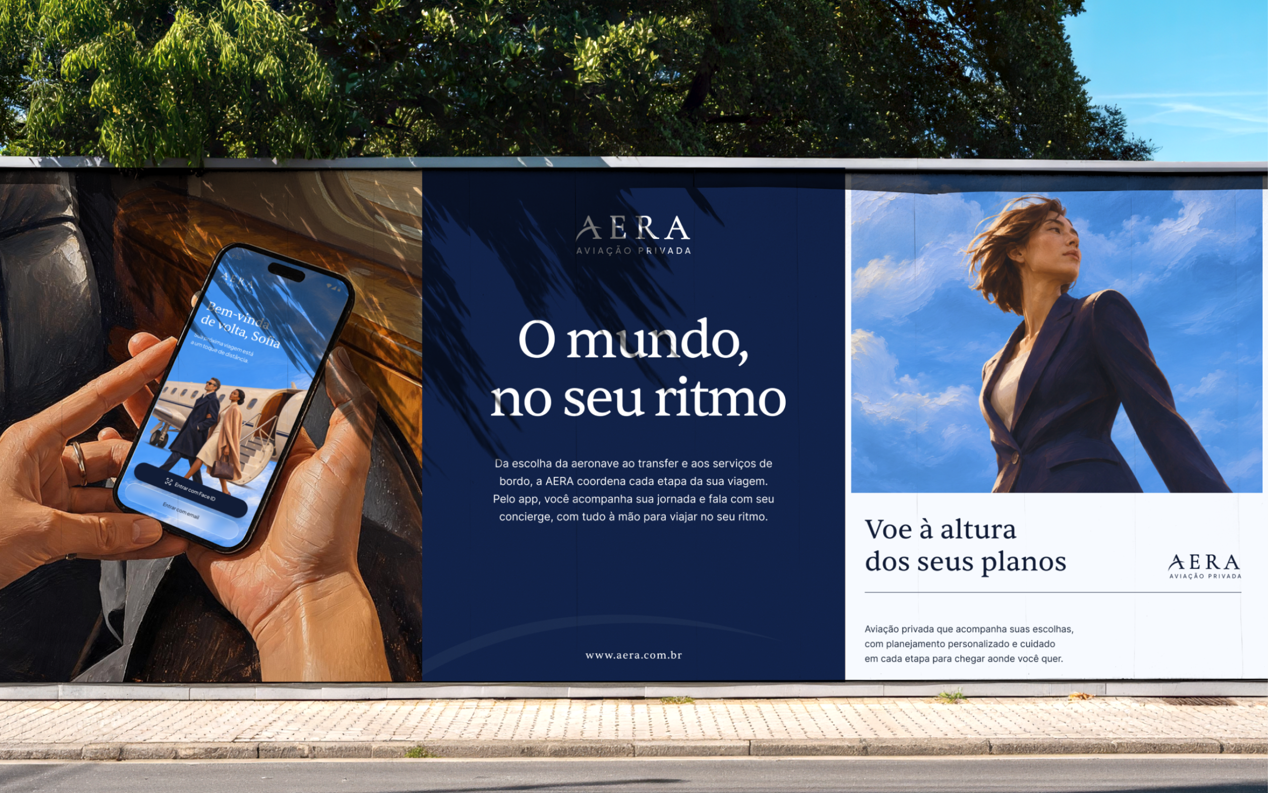
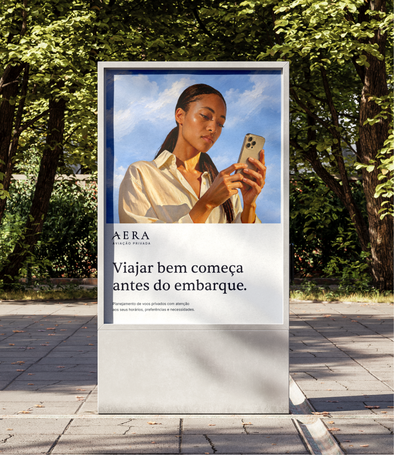
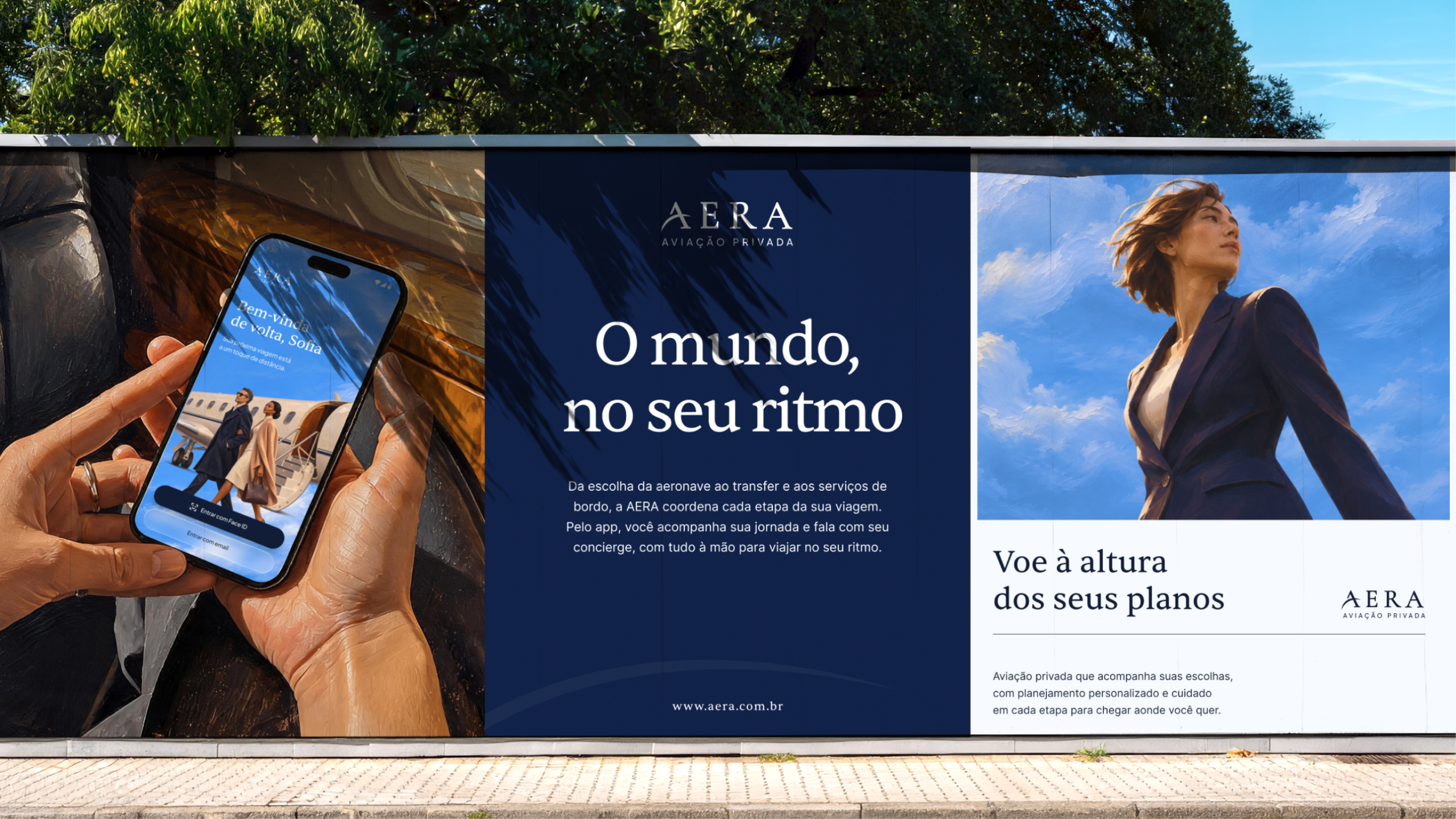
AERA identity on an outdoor panel, featuring the app and travel imagery.
Company / project
AERA
My role
Product Designer
Duration
6 weeks
Responsibilities
Visual identity, brand direction, exploratory research, UI/UX, interaction design and motion. Framer landing page.

A human perspective on private aviation, from brand to journey.

The challenge

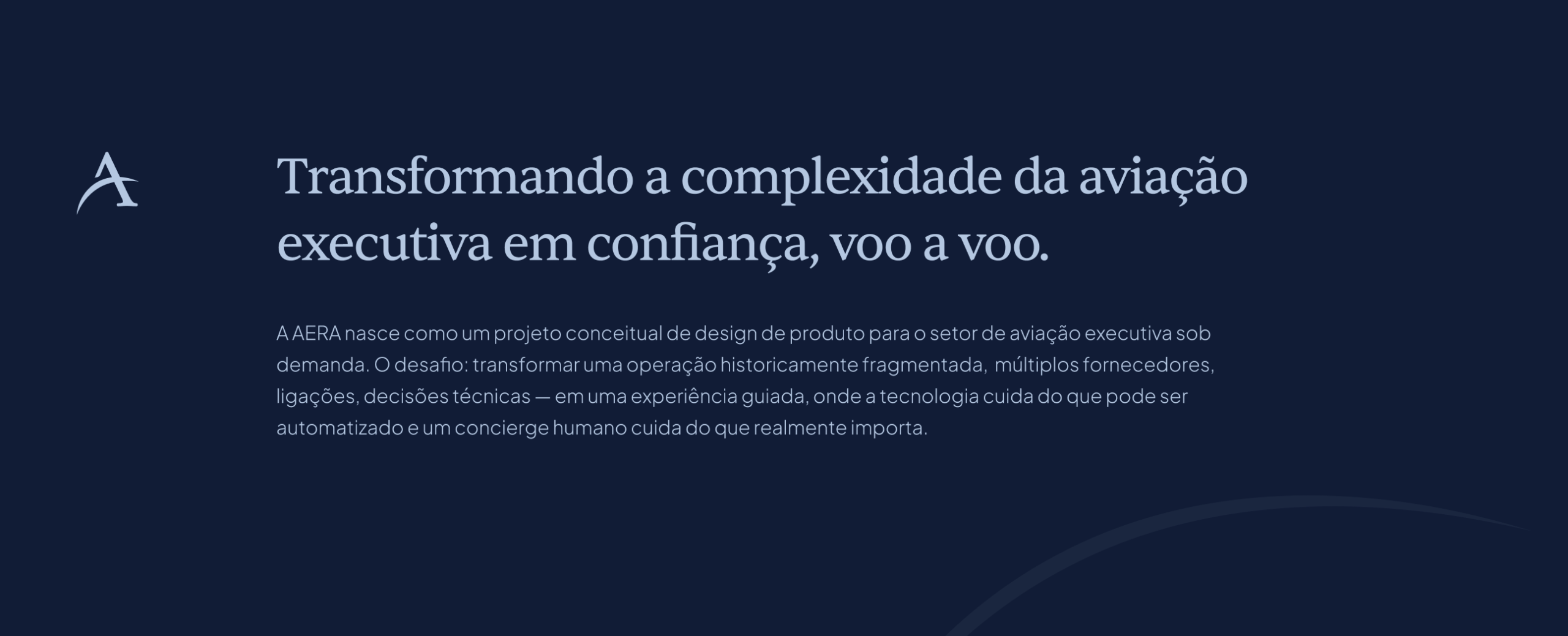
AERA is an independent brand and app concept for private aviation, also introduced through a landing page. The challenge is to combine editorial expression with clarity of use: respect the passenger’s time and preferences, connect trip stages and keep human support close.

01 / Brand identity

Care begins with the first impression.

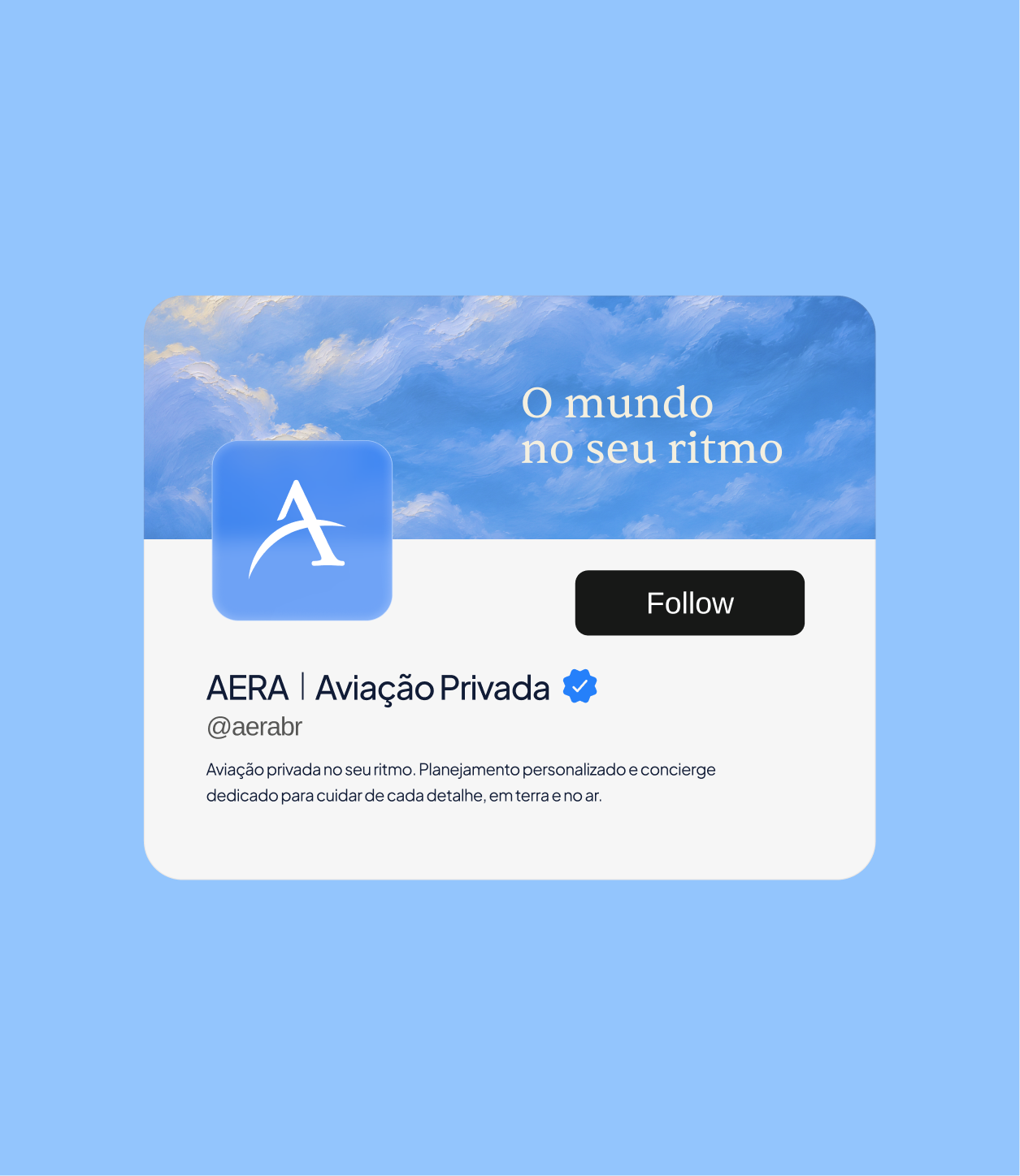
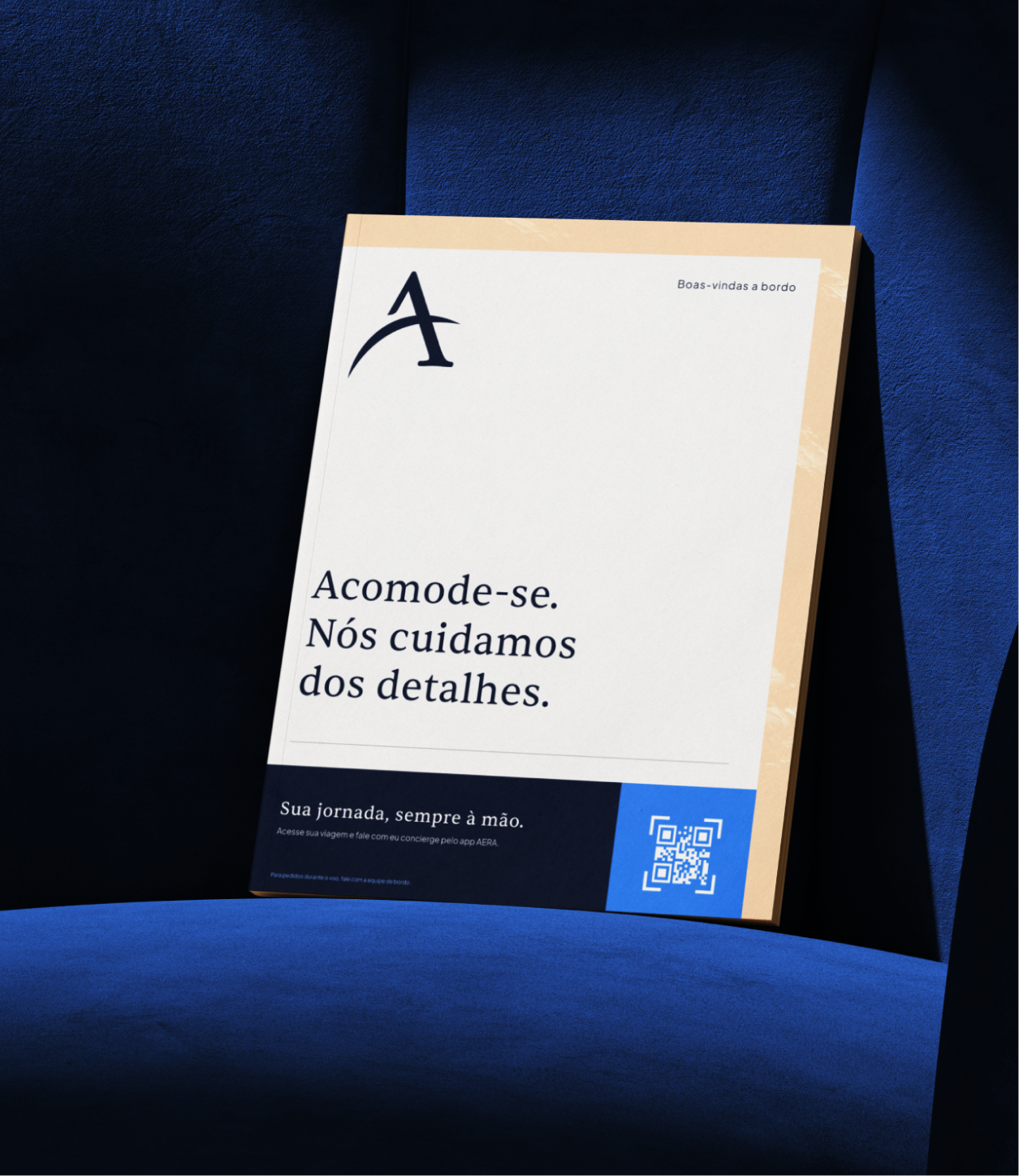
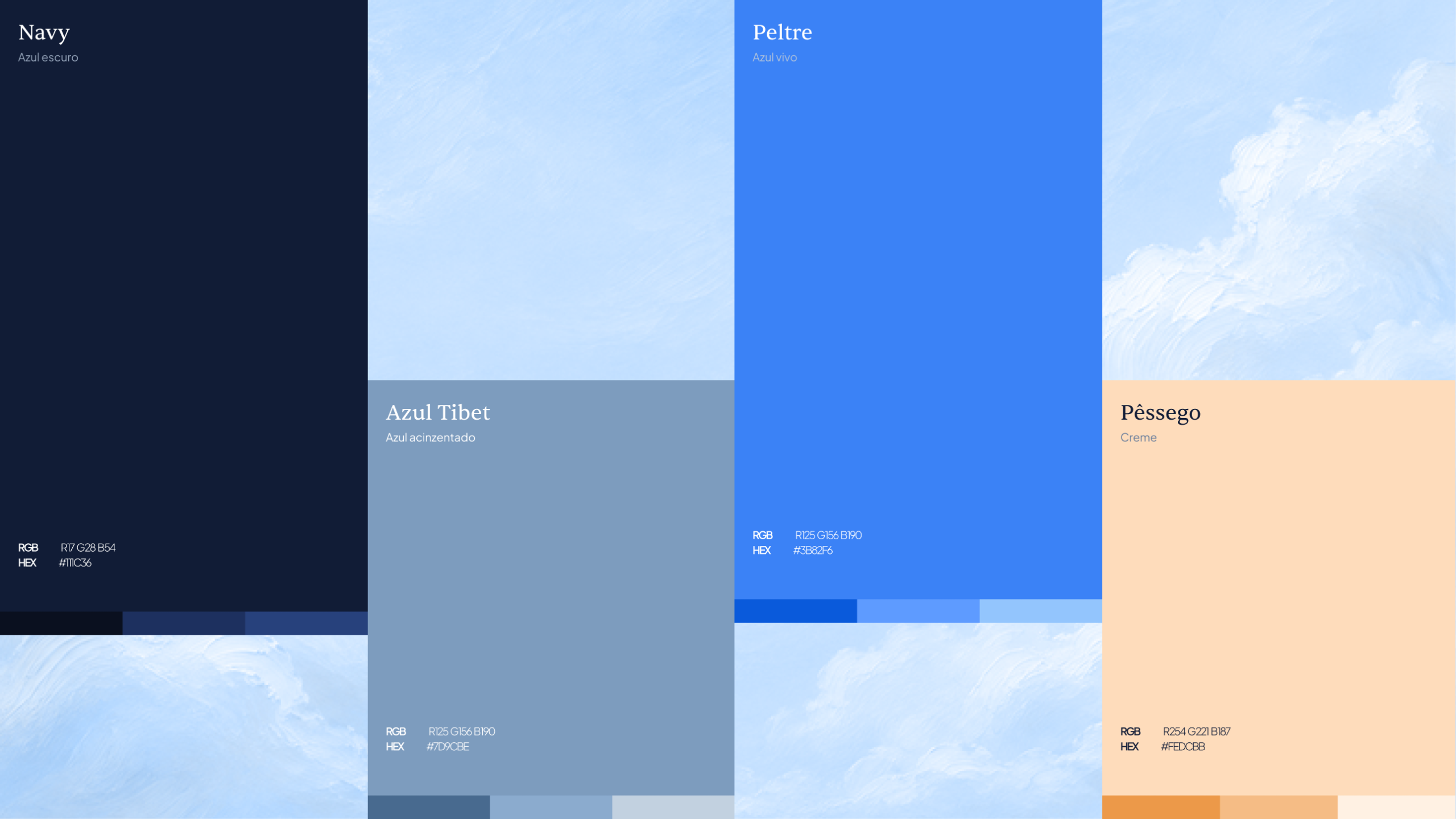
An editorial direction brings a human, sensory perspective to private aviation. Oil paintings sit alongside photographs; blue, navy, cream and warm tones meet serif typography. The care given to each image reflects the attention devoted to the journey, from communication to the app.

02 / Problem and scope

A trip starts before boarding.

The passenger’s time guides the project. Defining a route, reviewing a proposal and following preparations need to be clear steps. The concept brings them together, keeping preferences and support close to each decision.

Trip stages

  1. 01

    Plan

    Route, date and passengers.

    Is my request complete?

  2. 02

    Decide

    Proposal, inclusions and conditions.

    What am I accepting?

  3. 03

    Follow the trip

    Schedules, documents and services.

    What is already confirmed?

How research informed the scope

Exploratory analysis of public private-aviation service references helped organize the concept around requests, proposals and trip updates. The comparison focused on how each stage presents information and keeps support accessible.

That review informed three design criteria: make trip status explicit, bring conditions together before a decision and keep human support in context. These are exploratory guidelines; user validation is a next step for the concept.

03 / App / Core journey

Your trip, with everything at hand.

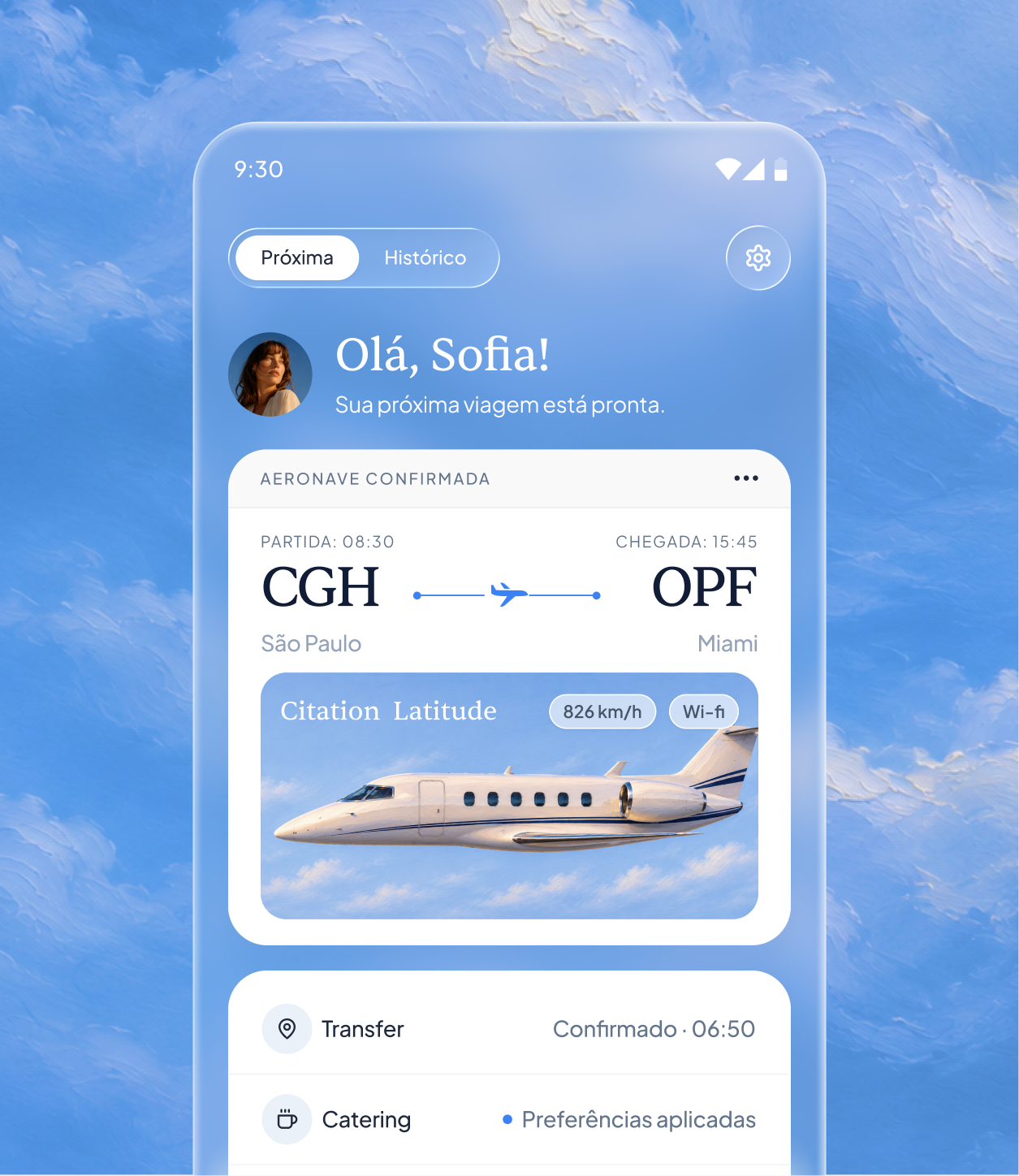
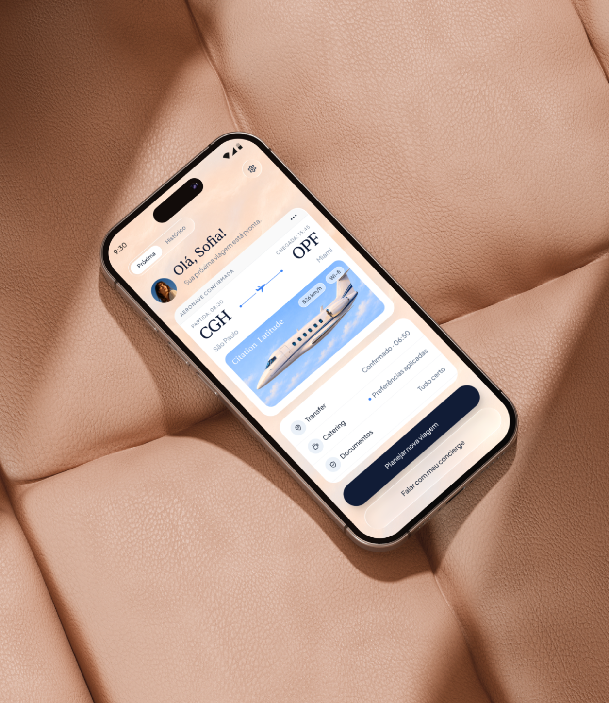
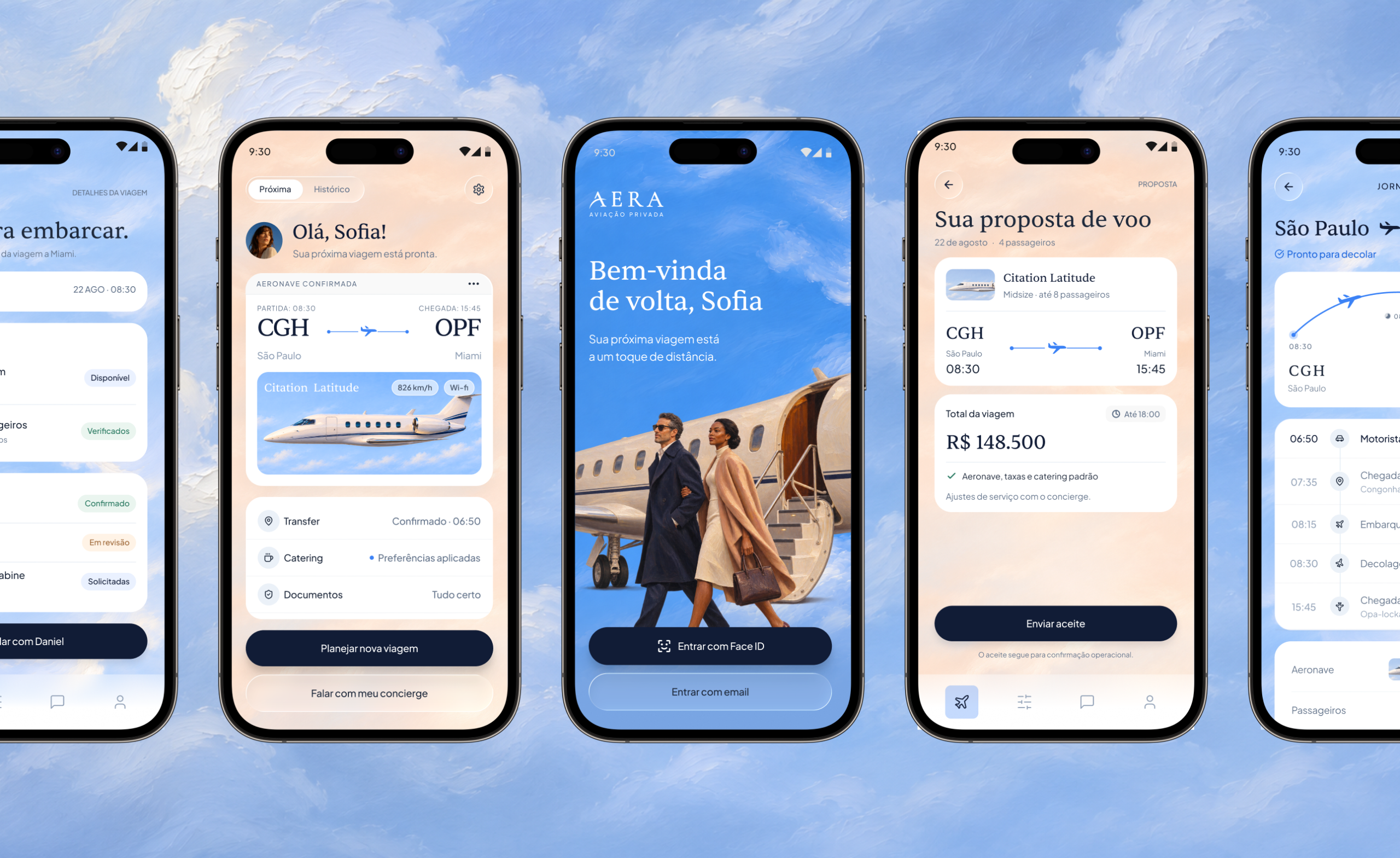
The app brings the brand’s personality to trip planning without compromising clarity. Route, proposal and journey details organize the navigation. Preferences stay with the request, and concierge support remains accessible throughout.

Planning, the trip and support in the AERA experience.

Trip flow

  1. 01

    Plan the trip

    Route, date and passengers form the request. Review brings these details and travel preferences together before sending.

  2. 02

    Review the proposal

    Aircraft, price, inclusions and conditions come together for an informed decision. Sending acceptance and having the trip confirmed remain distinct stages.

  3. 03

    Follow the trip

    Itinerary, documents and services stay connected to the same trip. Passengers can follow what is confirmed and reach their concierge when needed.

04 / Decisions and interaction

Confidence is built in the details.

Peace of mind also depends on understanding what comes next. Copy, hierarchy and motion make trip states clear, give changes context and keep support within reach.

01 / Clear states

Received, accepted and confirmed are different moments.

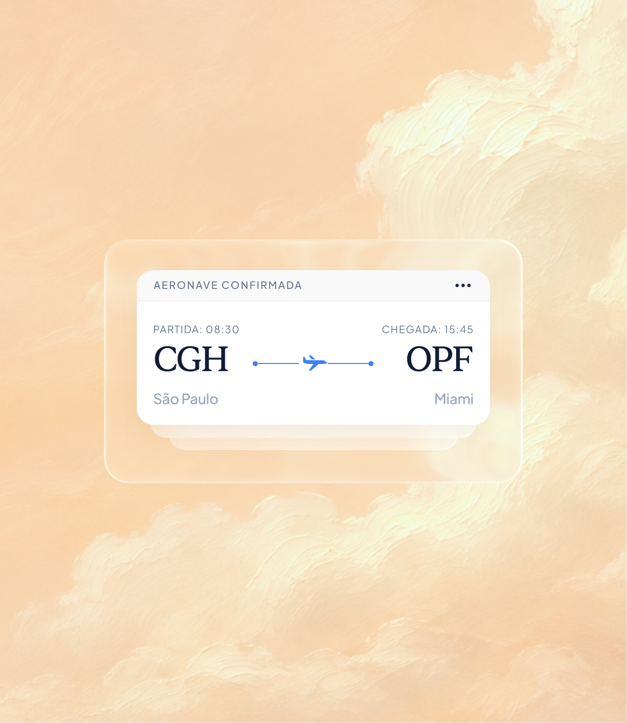
In the concept, sending a request, acceptance and operational confirmation have distinct meanings. Copy, color and transitions reinforce the current state without relying on a visual indicator alone.
02 / Changing plans

Compare what changes before deciding.

For changes of plan, the design principle is to preserve the current trip as a reference. Time, services and price differences belong in the same comparison before a new acceptance.

03 / Support in context

Personal support, in the context of the trip.

Concierge support is part of the app experience. Conversations and updates stay connected to the trip, providing a shared reference for schedules, services and preferences.

05 / Interface system

One language across the trip.

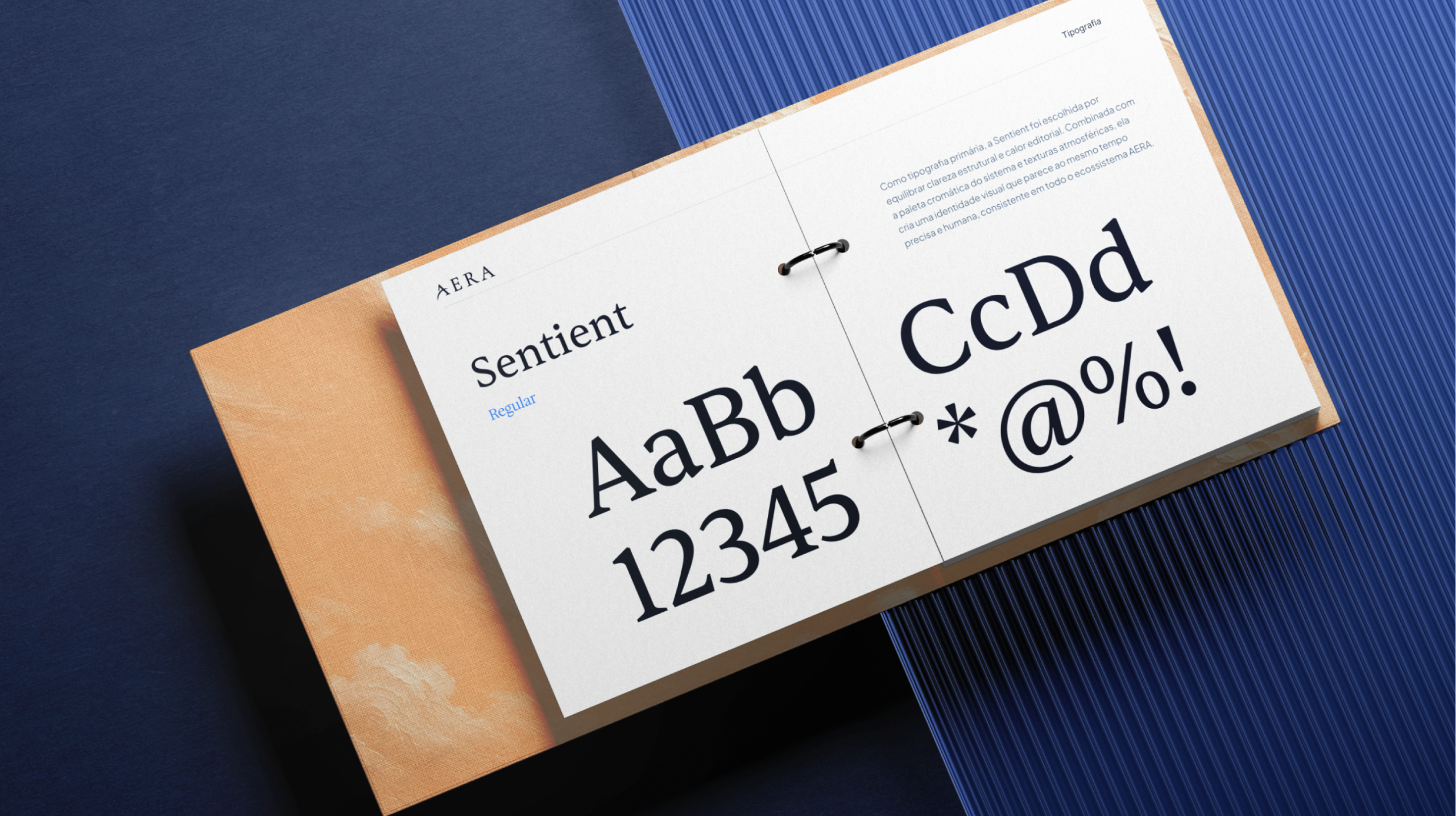
Brand expression sits alongside a practical interface. Route, services, forms and actions follow a shared hierarchy. Typography, spacing and states help people find information and recognize the next step.

  1. 01

    Route

    Origin, destination and schedules as a recognizable information group.

  2. 02

    Services

    Preferences and confirmations identified for each trip item.

  3. 03

    Forms

    Request details organized for entry and review.

  4. 04

    Actions

    Labels that explain the next step and request status.

06 / Landing page

The first impression sets the tone for the trip.

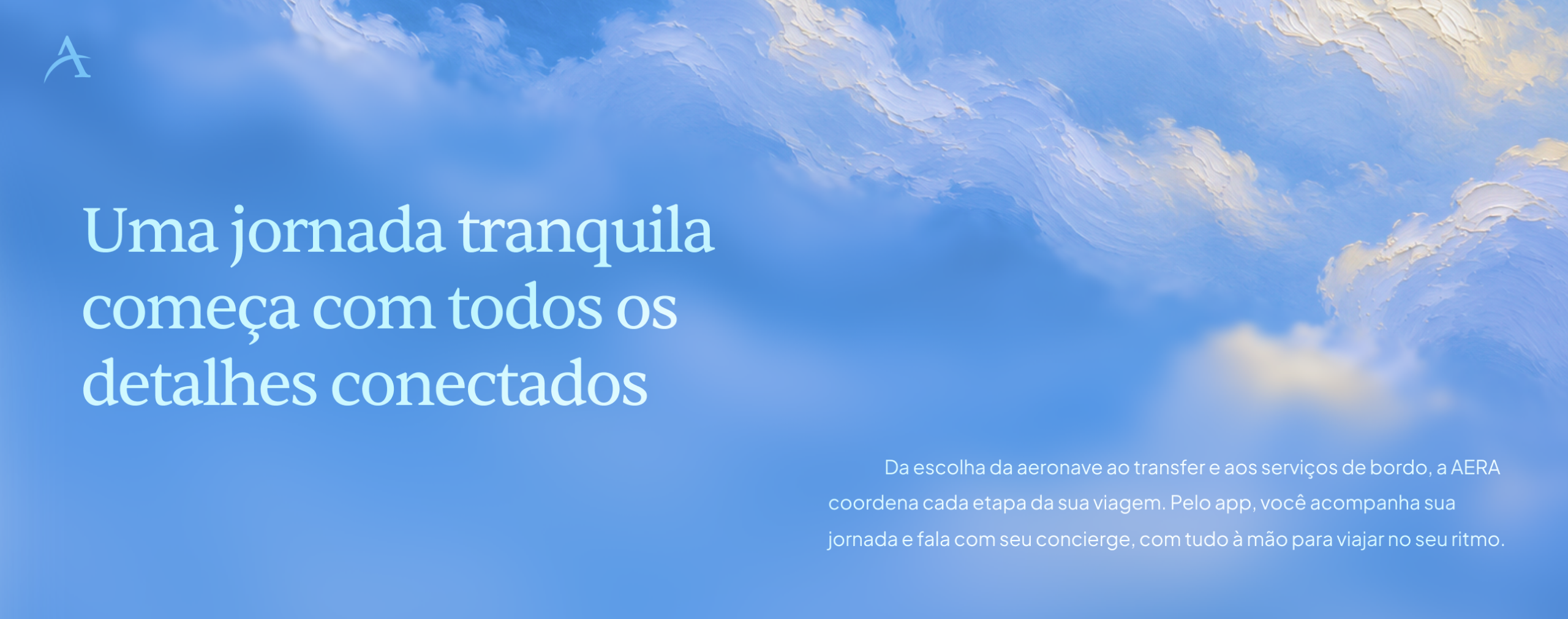
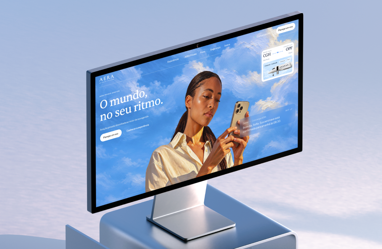
The Framer landing introduces AERA, explains the experience and opens a channel to support. Images and copy invite people to explore the service; the app carries that experience into planning and following the trip.

One landing sample: introducing the service and the app.

07 / Deliverables and learnings

A defined direction. Hypotheses to validate.

The outcome connects an editorial identity with a practical travel experience. Its premium character rests on care in the details, clarity and personal support. The next step is to assess with users how well they understand states and move through the journey.

  1. 01

    Defined in the concept

    Editorial identity, image direction and an app organized around planning, concierge and the journey.

  2. 02

    Central decision

    Connect information, decisions and support within the context of the same trip.

  3. 03

    To validate

    Distinguish request, acceptance and confirmation; assess alternatives; find documents and support.

An independent concept, not launched. No usage or business metrics have been measured. User validation remains a next step.

Next case

GROND

Autonomous inspection

Back to selected work